Overview:
Lorena Reis is an integrative therapist, always striving to develop her role in the best possible way.
She graduated in Psychology, which gave her the foundation to explore other therapeutic approaches such as ThetaHealing — currently her flagship practice — as well as MQE (Quantum Stellar Table) and Aromatherapy.
Her work is guided by a single purpose: to help patients achieve well-being on physical, mental, emotional, and at times spiritual levels. She believes the human being is biological, mental, and spiritual, and that these three dimensions must always be in constant interaction.
Goals:
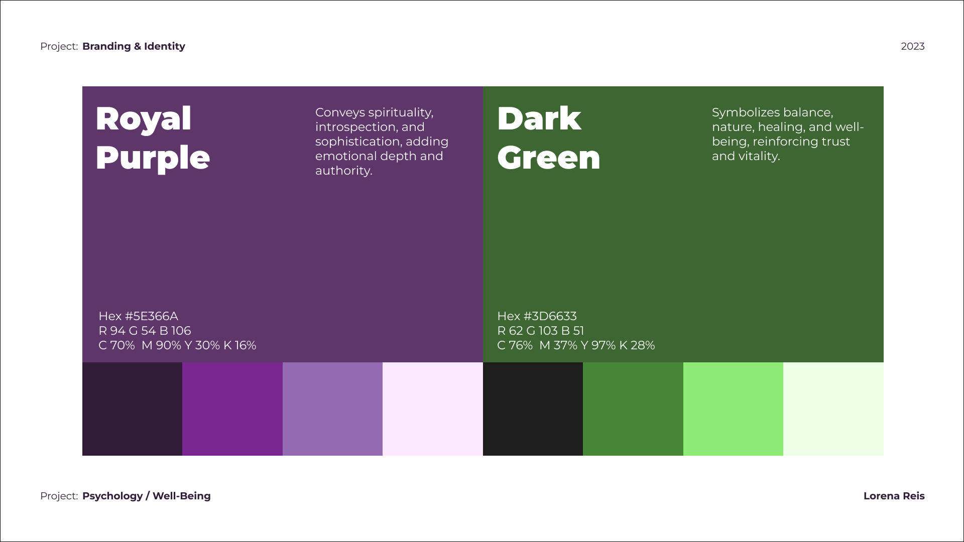
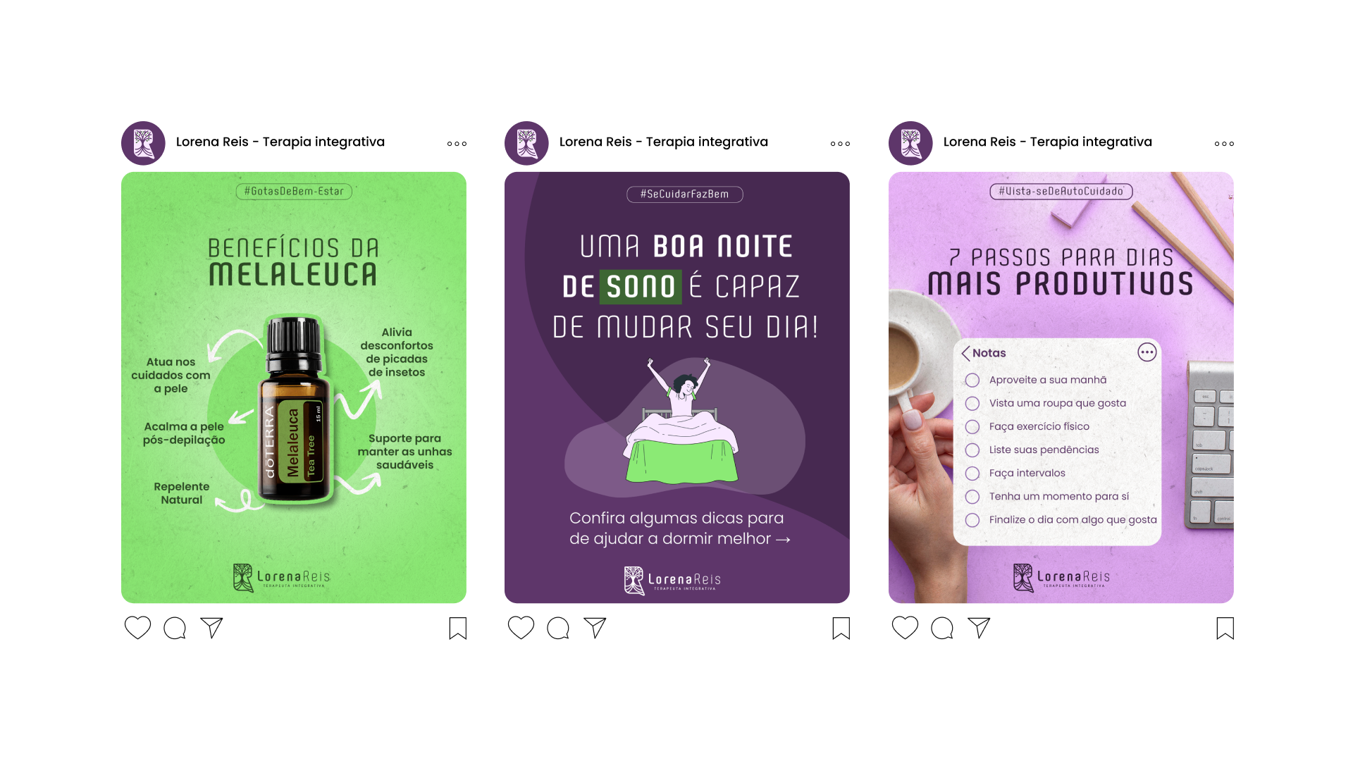
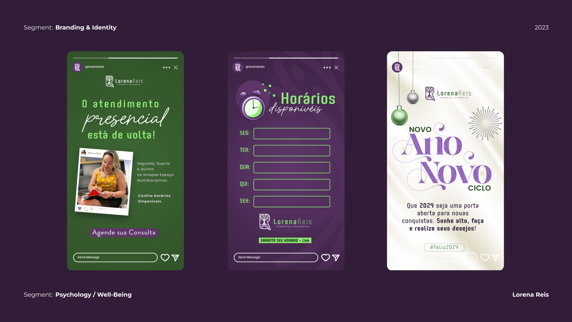
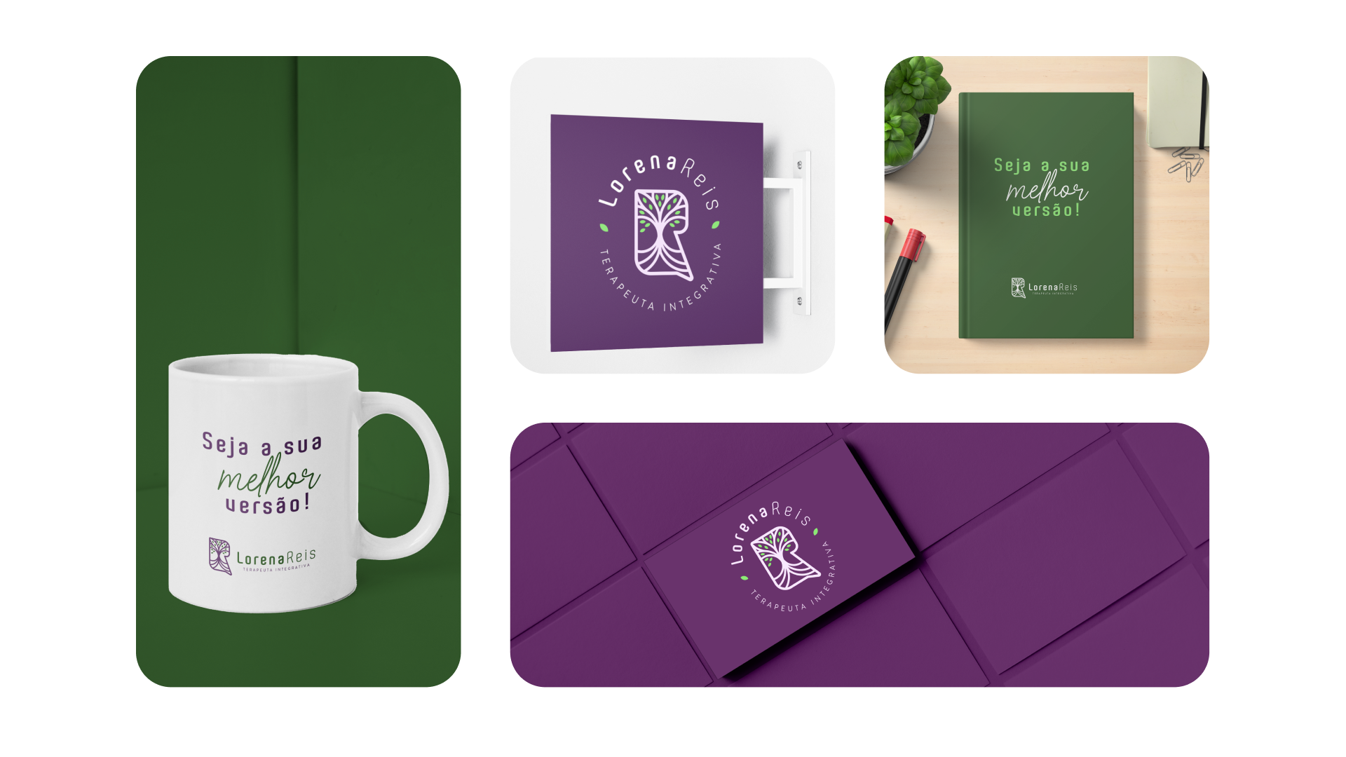
The challenge was to build a strong, empowered brand that balanced emotional depth with a subtle touch of boldness. The goal was not only to create visual impact, but also to shape a narrative that would resonate with the audience on a personal and aspirational level.
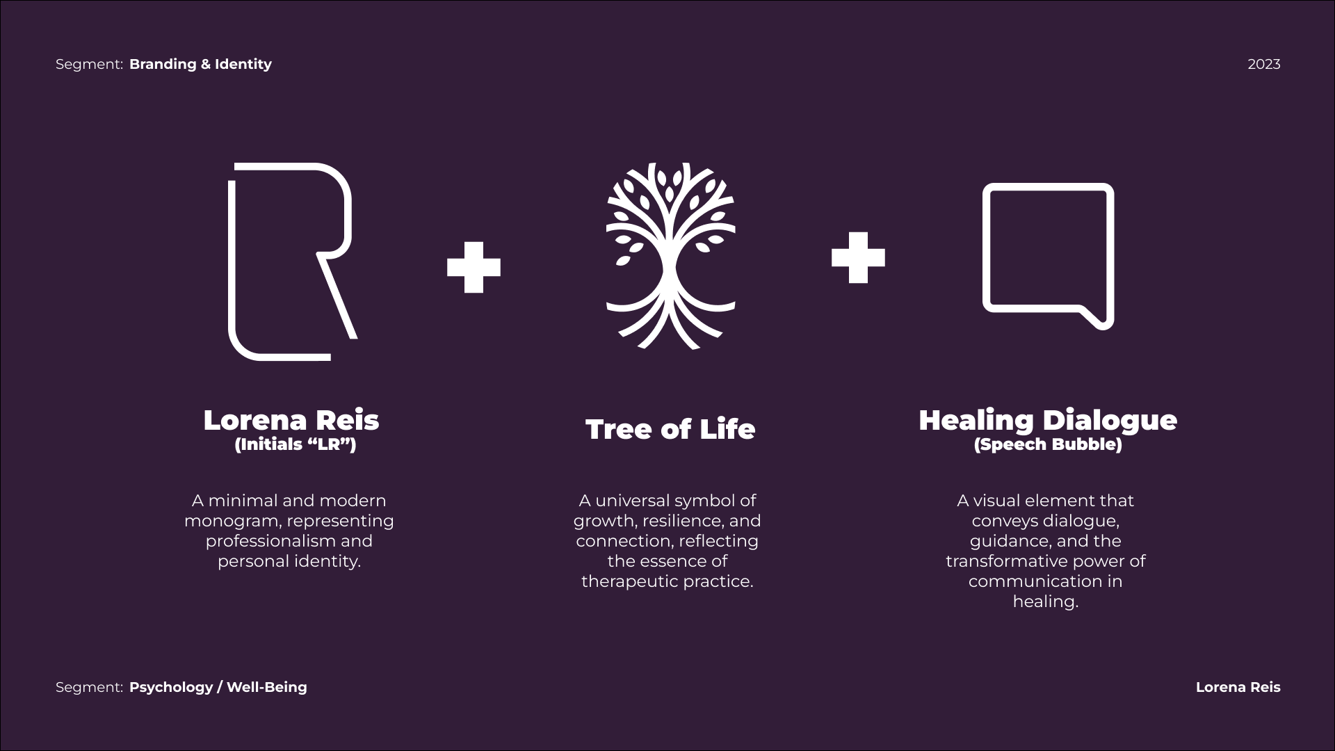
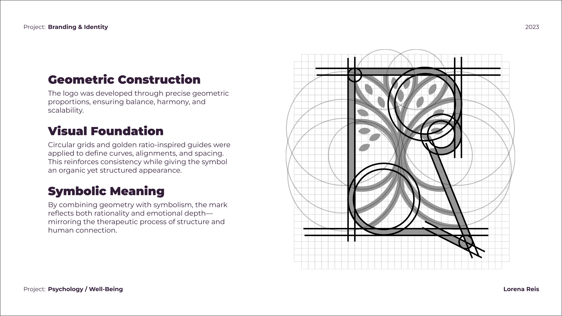
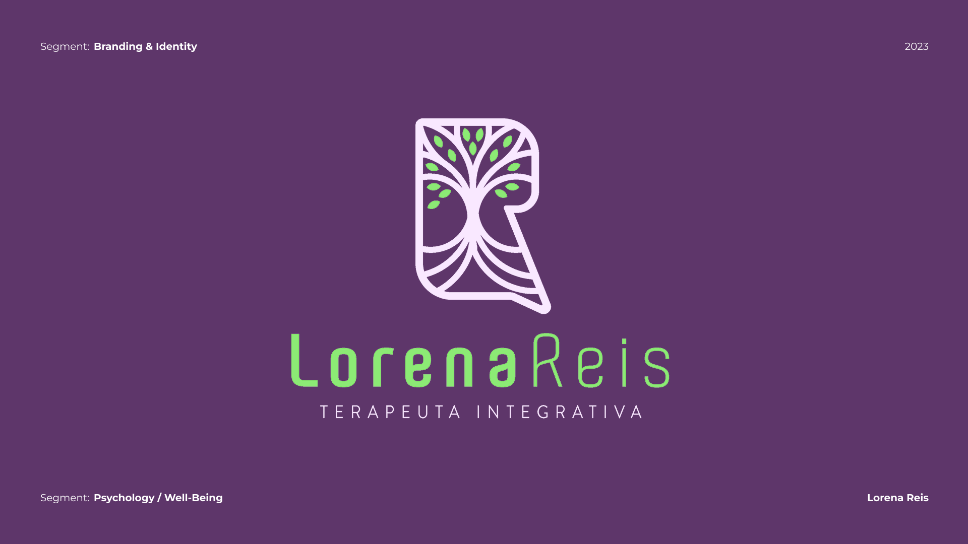
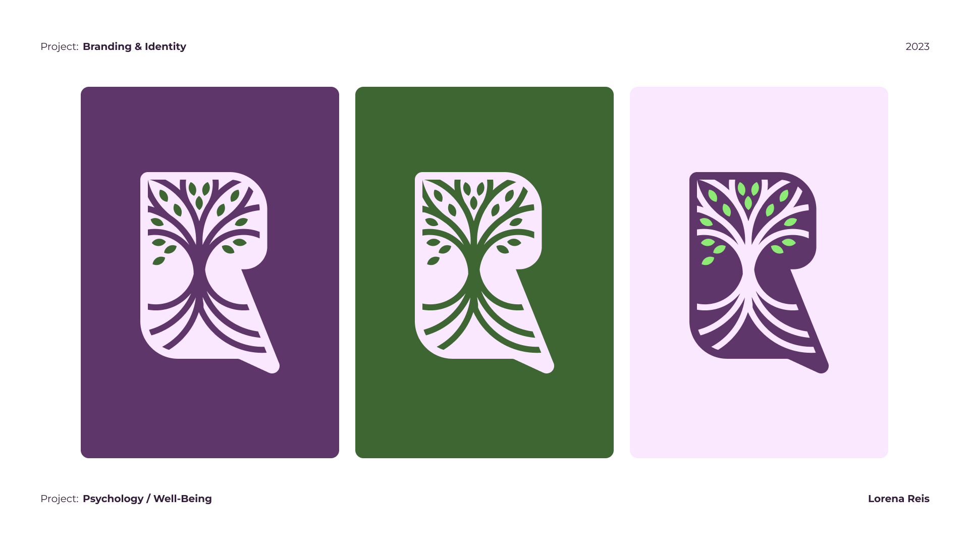
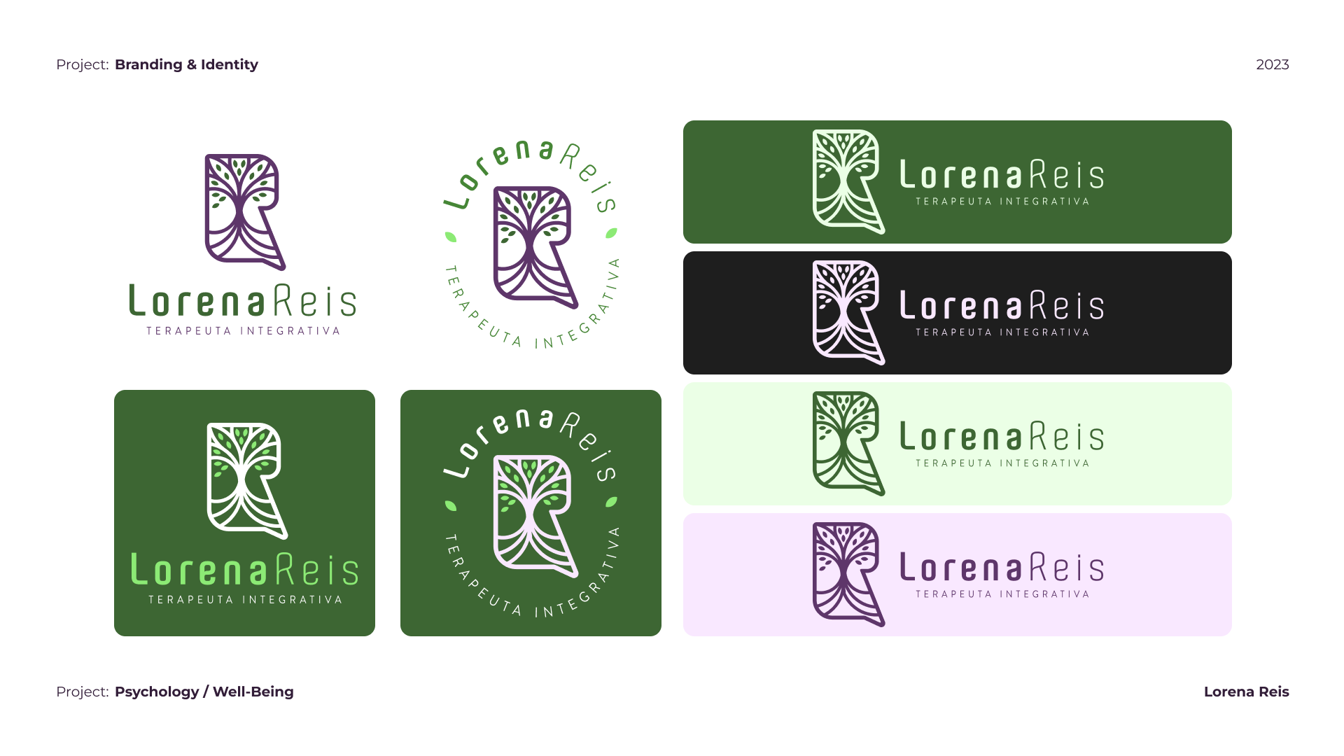
One of the key requests was to incorporate the Tree of Life as the central element of the visual identity. This symbol was carefully explored to represent growth, resilience, and expansion, while emphasizing the importance of staying connected to one’s roots. The design sought to bridge tradition and modernity, creating a versatile identity system capable of adapting to different contexts without losing its essence.
Ultimately, the project delivered a brand language that feels both inspiring and grounded—an identity that reflects emotional connection, ambition, and a confident sense of purpose.